All work

Branding · Art Direction · Creative Direction

Rebranding the legendary End of an Ear

A brand-system proposal for an Austin institution. Creating a deployable system for the company's digital presence and modernizing the experience while staying true to the legacy visual identity.

The End of an Ear logo — a concentric arc mark resembling a record groove and a rising sun, beside the wordmark on a deep navy ground
My role
Principal design, branding, art direction, and creative direction across the identity and e-commerce concept.
The context
End of an Ear, formerly 33 Degrees, has served independent music fans for 20-plus years, and had recently relocated and expanded.
The challenge
Modernize the brand without eroding its legacy, and translate the in-store experience of discovery into an online shop.
The idea
Brand elements that reference vinyl while reading as a pathway into sound — flexible enough to work across genres.
End of an Ear brand banner — 'Curated, underground & independent since 1995' over a dark record-groove texture The End of an Ear mark applied across genre treatments — a navy lockup, a neon-yellow jazz record, an orange rock crate display, and the black logo Four End of an Ear artist posters with the concentric-arc mark in pink, yellow, and blue colorways over duotone musician photography
Decision · vinyl is iconic and can represent sound

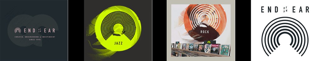
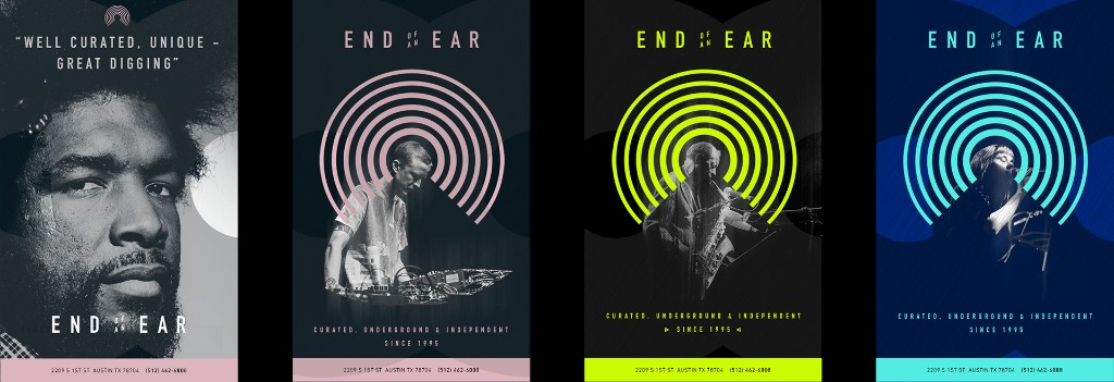
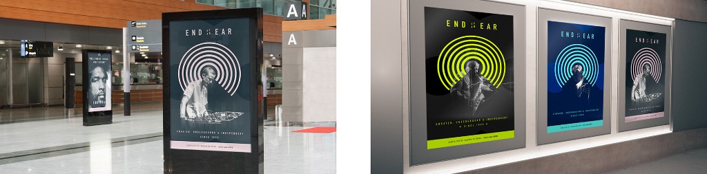
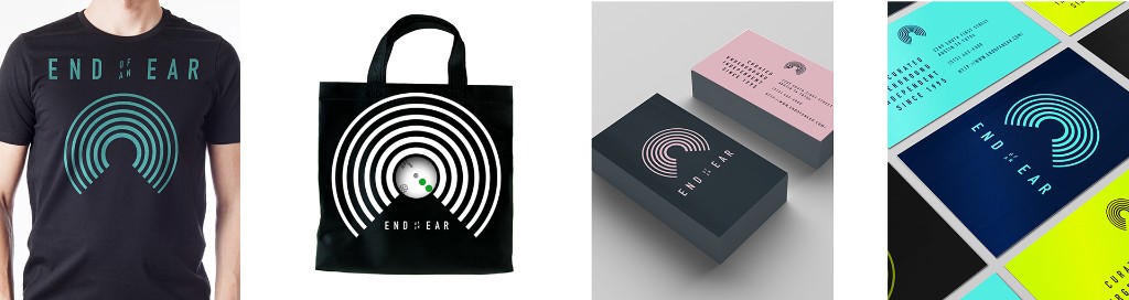
Brand elements reference vinyl records, but they also connote a pathway into sound — fitting, because a record store is where you go to experience new music. Just as important, the elements were built flexible enough to deploy across genres rather than locking the shop into one look.

End of an Ear out-of-home placements — illuminated transit and wall posters featuring the concentric-arc mark in neon, blue, and pink colorways End of an Ear applied to merchandise — a t-shirt, tote bag, and business cards using the arc mark

Translating the shop online

The e-commerce concept displays recent acquisitions of vintage records alongside new releases, merging the functionality of the several social channels the shop currently uses. Search sits front and center, since that's where many people start.

The End of an Ear e-commerce concept shown across desktop and mobile — homepage spotlight, search-led browsing, gift cards, and product detail screens
Decision · keep the in-store cues online

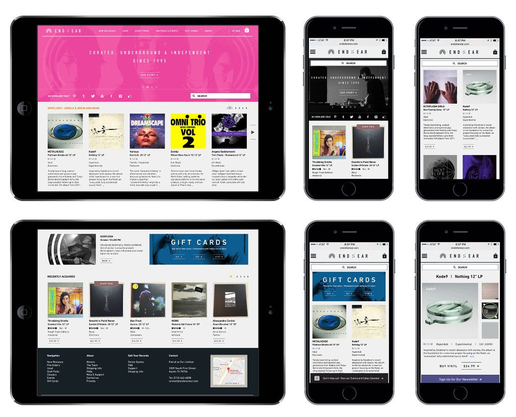
Wayfinding elements like "staff picks" translate the physical shopping experience to the web, and campaign areas stay simple, large, and duotone as a nod to legacy branding. We wanted the online store to feel like walking into the shop.

An animated 'staff picks' wayfinding element from the End of an Ear online store
Next

Design Management

Like this kind of brand work? Let's talk.

© 2026 Robert ChuBack to home