
Design Strategy · Research · Data Visualization
Blackboard's data platform had to take available student data out of a massive data lake and make it actionable for a wildly diverse set of users. Everyone from system administrators to faculty members needed to have access to this information where they live and in a way that they could easily understand.
Business stakeholders wanted a product that turned available student data into action for academic administrators, students, and faculty alike.
At the end of the day, this was all about bringing a wide spectrum of user preferences closer together in the data sharing loop.
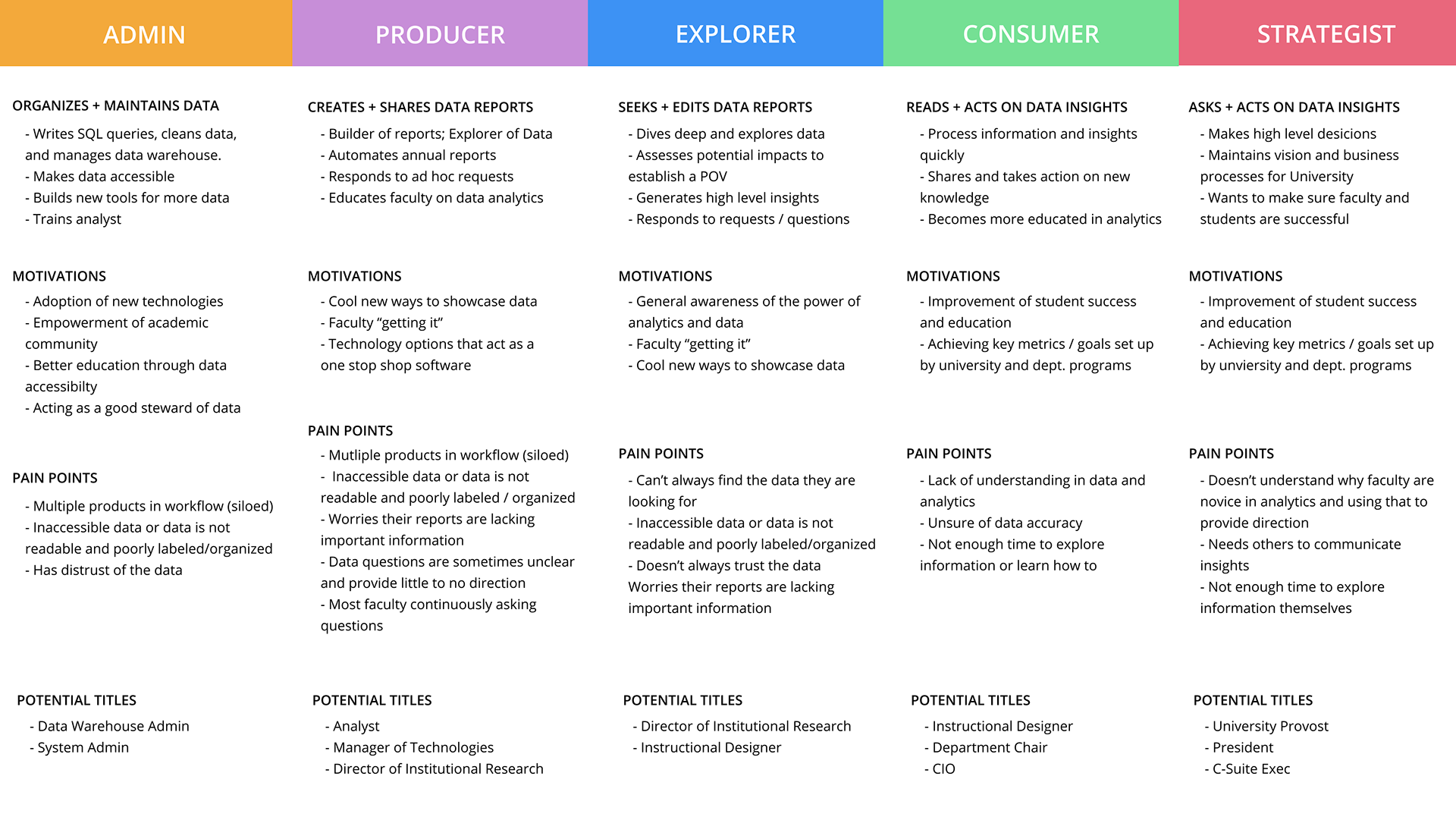
Research had seeded a set of behavioral personas, and the organization also had a set of more traditional marketing personas. I helped merge the two; taking useful insights from each and combining them into a hybrid set.
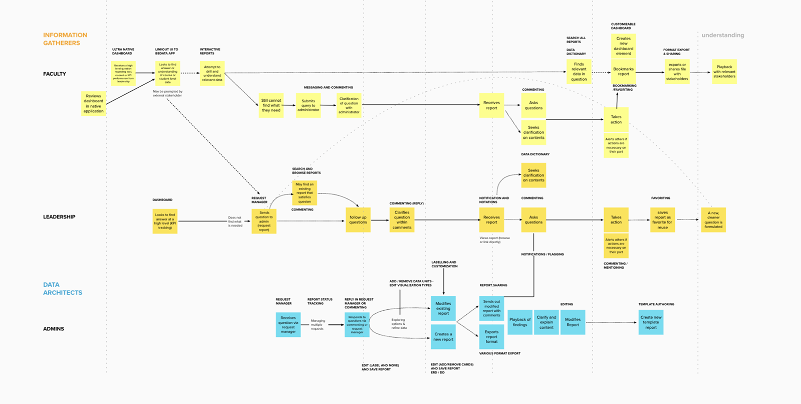
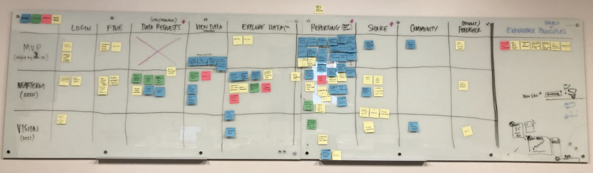
Rather than trust merged personas, we ran remote and in-person contextual inquiry to validate them. Those sessions let us further iterate on the personas and build an end-to-end journey. Together, with our development and product teams, we laid out each stage of this journey and rated them on an impact/feasibility scale to set a short / mid / long term delivery roadmap.
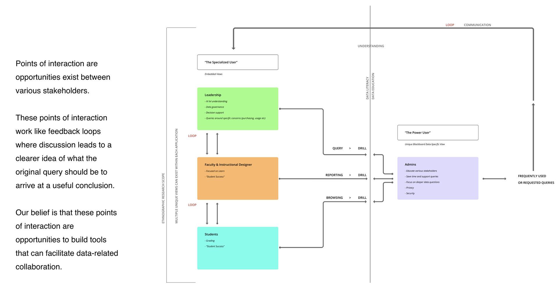
The defining insight of the research sprint: the product had to bring data-fluent users and data lay-persons closer together. That became a core pillar shaping the vision.
"(One of our biggest data problems is) people not knowing what the other hand is doing."
Working closely with the data-science team, I drafted concepts spanning a wide range of visualization methods. We had healthy debates on topics like data governance, how to show an individual student against the larger cohort, and what actually predicts a final grade. We aligned on lo-fi, moved to mid-fi, then put concepts in front of users through moderated usability testing.
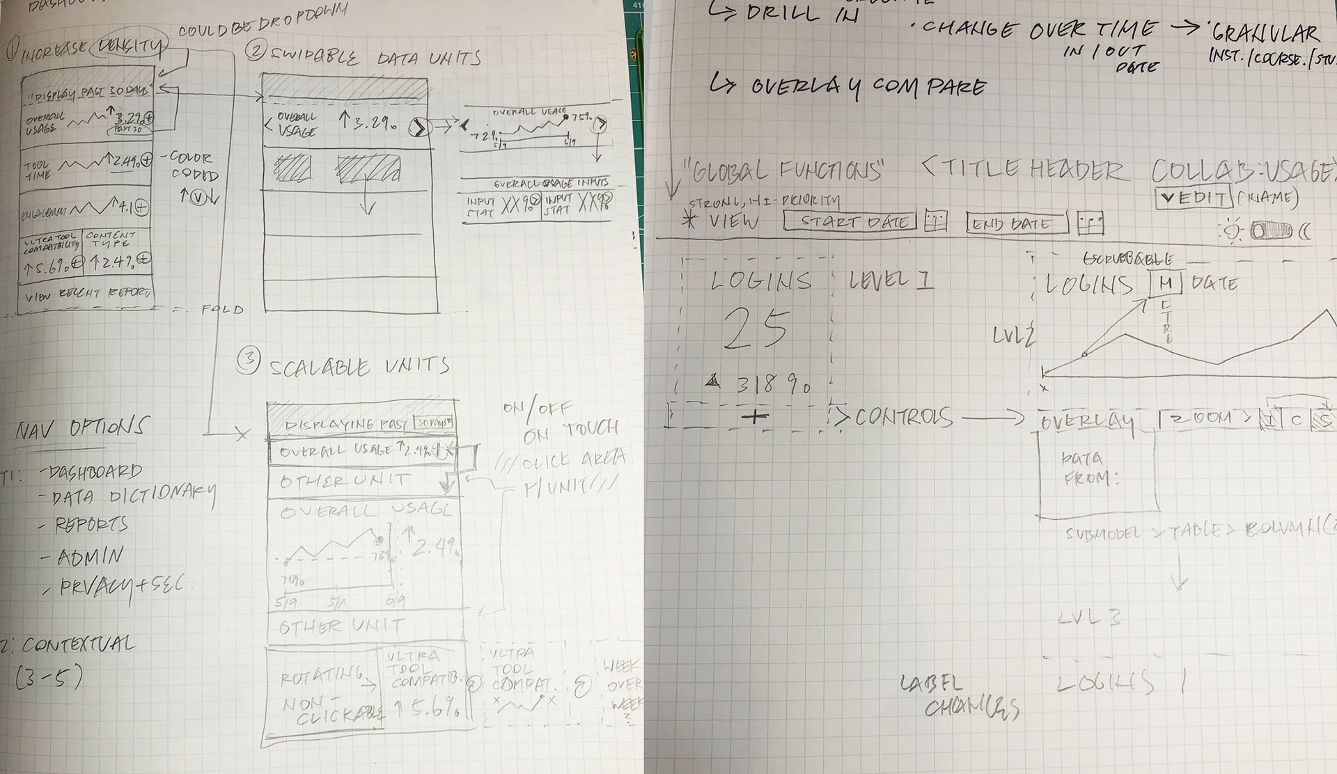
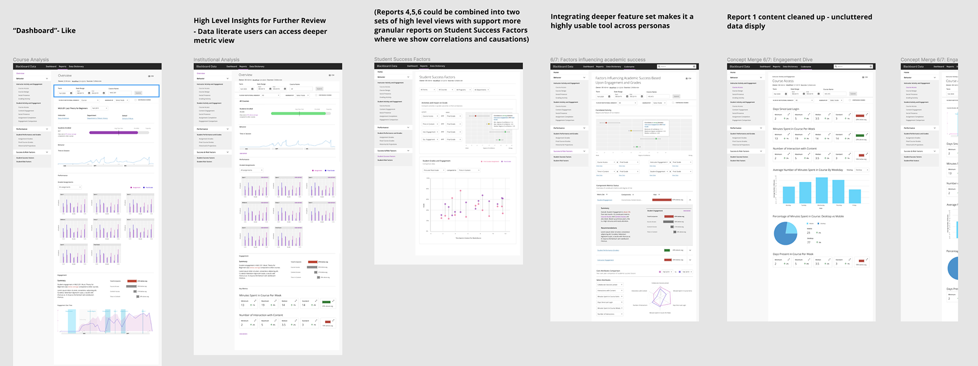
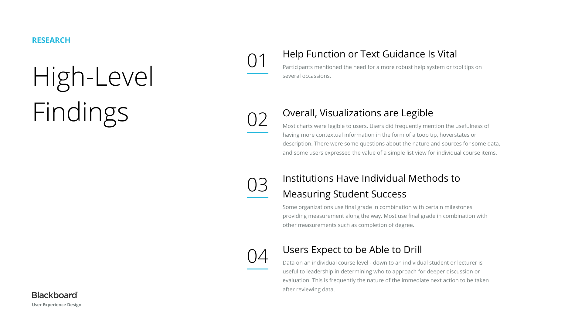
When usability and concept testing essentially told us that the current concept wasn't there yet, we iterated rather than shipped. That feedback drove customizable user views, rethought collaboration tools, more careful data-drilling guardrails, and much-needed explanatory copy where users felt lost.
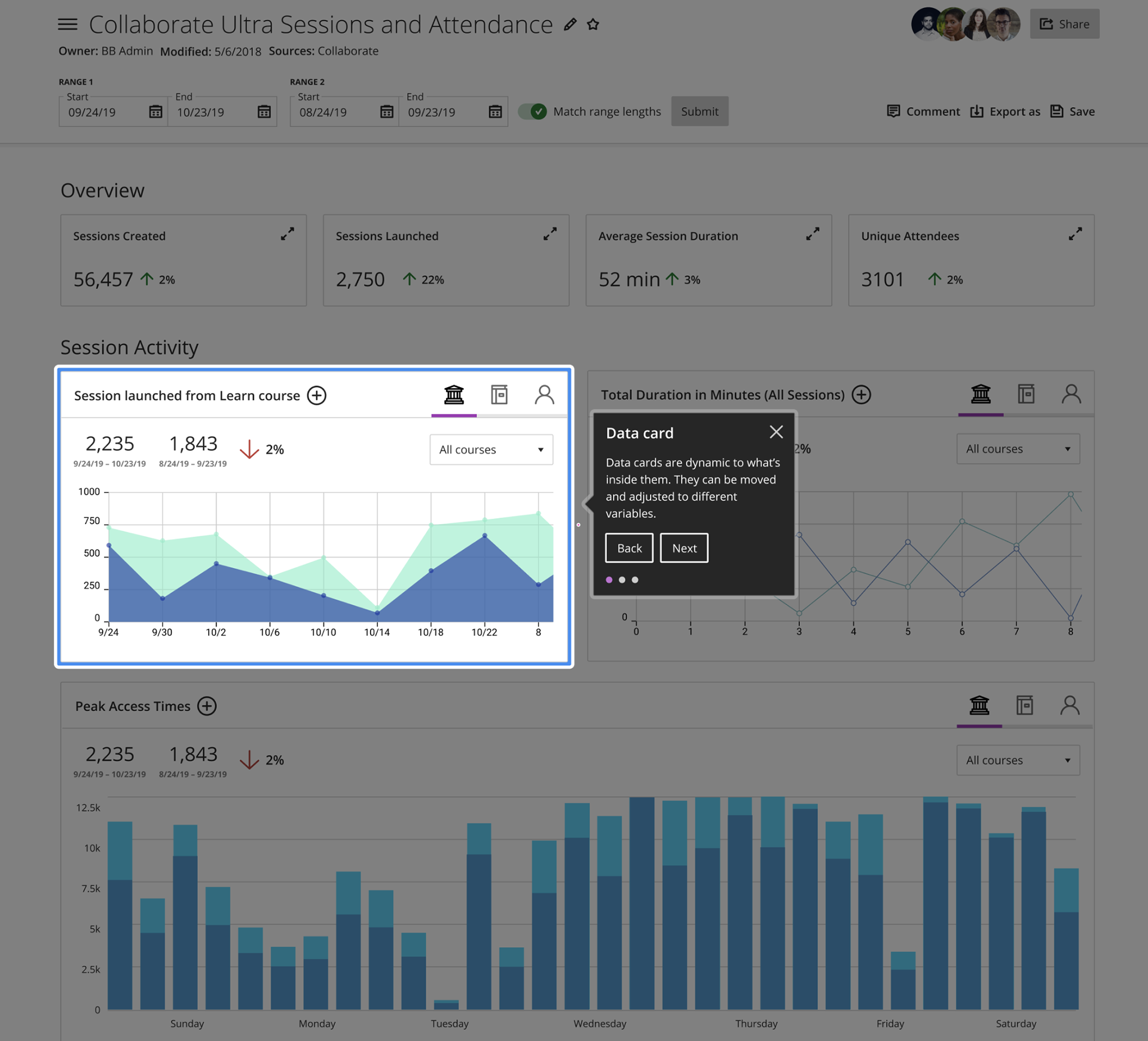
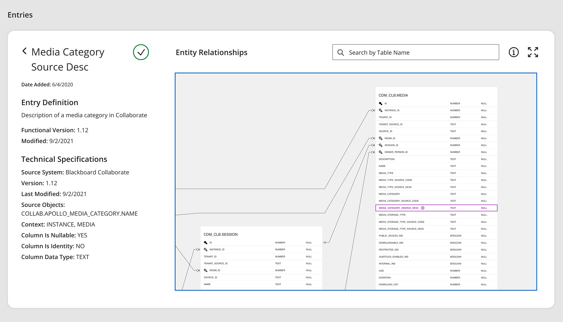
We ended up prioritizing high-level summaries of overall academic risk in a timeline format as users strongly preferred views that showed quantitative change across a semester; adding comparison data where needed. The GA/MVP release merged the data-reporting workflow with entity-relationship-diagrams and data-dictionary functionality.
Note: ERD visualizations that let data-fluent users explore relationships within the canonical data model. This was a feature that also required a great degree of learning and user evaluation as concepts like crows foot notation were totally new to many of us, and the interviews we had around this concept were fascinating.
Design strategy didn't end at launch. To keep the product aligned with a rapidly evolving industry landscape, we periodically realigned on personas through workshops and research. Once a year I ran a user-story-writing workshop for the analytics team to author new stories for PI planning.
The next phase is about bringing the right data to the right people inside their existing LMS workflow — work I had been prototyping with the product team. The key pillar here remained the same: data is only valuable when the right person can act on it, and in order to do that they have to understand how it is relevant to them.