UX Strategy · Vision-Setting · Enterprise
Having watched their paychecks fluctuate by significant amounts month to month, scattered across multiple tools, with no discernible line from effort to income, Salespeople have grown increasingly frustrated a real lack of visibility into compensation. I, along with another strategist and a pod of 6 other team members, led the work from a point of real ambiguity towards a testable product vision built around how sellers think and work.
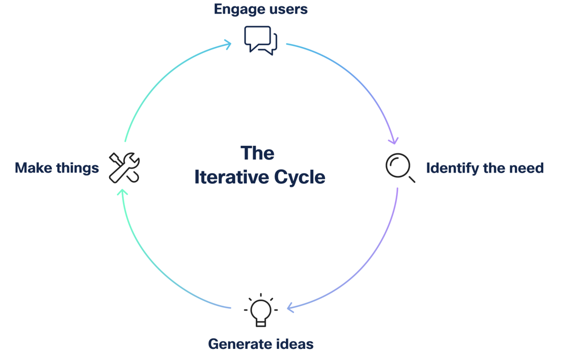
Over time, as layer after layer of functionality gets bolted onto a product, the experience drifts into something disjointed and confusing. When that happens, it's best to take a step back and define a vision around the user's real needs and workflow. That was my job here.
Out of respect for Cisco's NDA, some details and screens are omitted — although I'm happy to talk through what I can in person.
We ran extensive discovery with business and sales stakeholders, then pressure-tested it against the people living the problem. Two truths became apparent: sellers had to hop across multiple tools to assemble a holistic view of their compensation, and when they couldn't see how their sales behavior drove their income, they were both frustrated and less motivated to chase the right goals.
"I don't want to waste my time. But at the same point, I want to understand why I get paid what I do, and I struggle to connect the dots." — Business Development Team Member
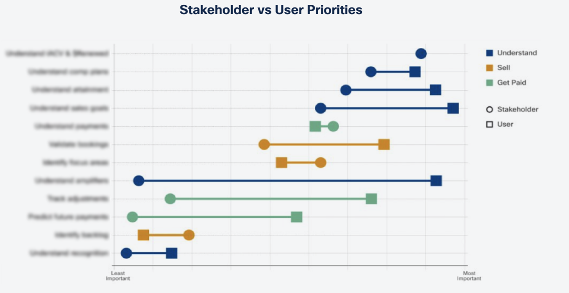
We anchored the work in jobs-to-be-done, framed as the questions a seller actually needs answered: How much will I be paid, and why? How am I doing against my goals? What other incentives are available to me? Framing it as questions rather than features kept the team honest about what we were really solving.
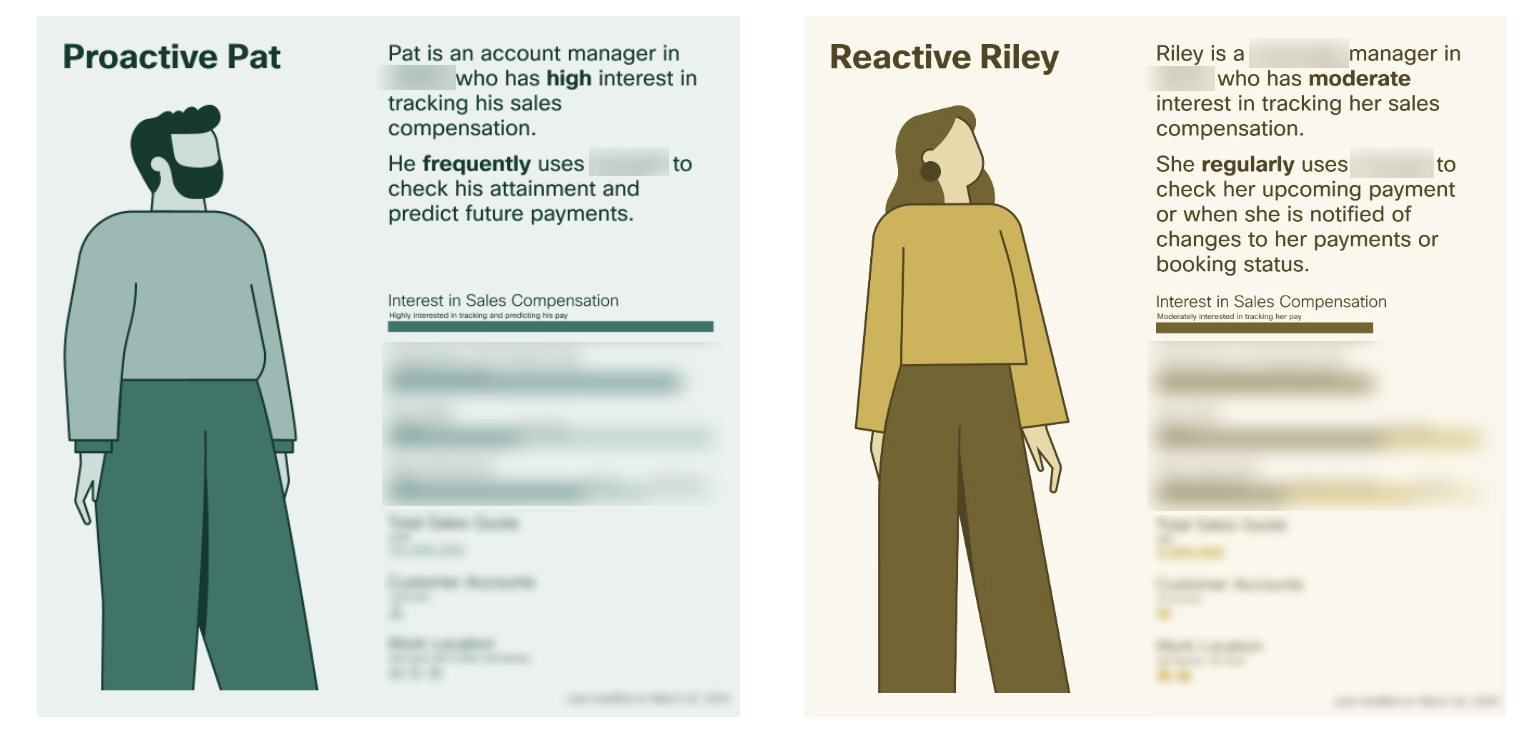
Through user research, we realized that we were dealing with two "extremes" of behavior. One individual who was more attentive and actively engaged with their compensation, and another that was more passive. My goal was to satisfy both polarities of engagement; thereby addressing all the gradients of behavior in between.
Aside from the textbook march from research to wireframes to prototype, what is most notable about this project is the calls we made and why we made them.
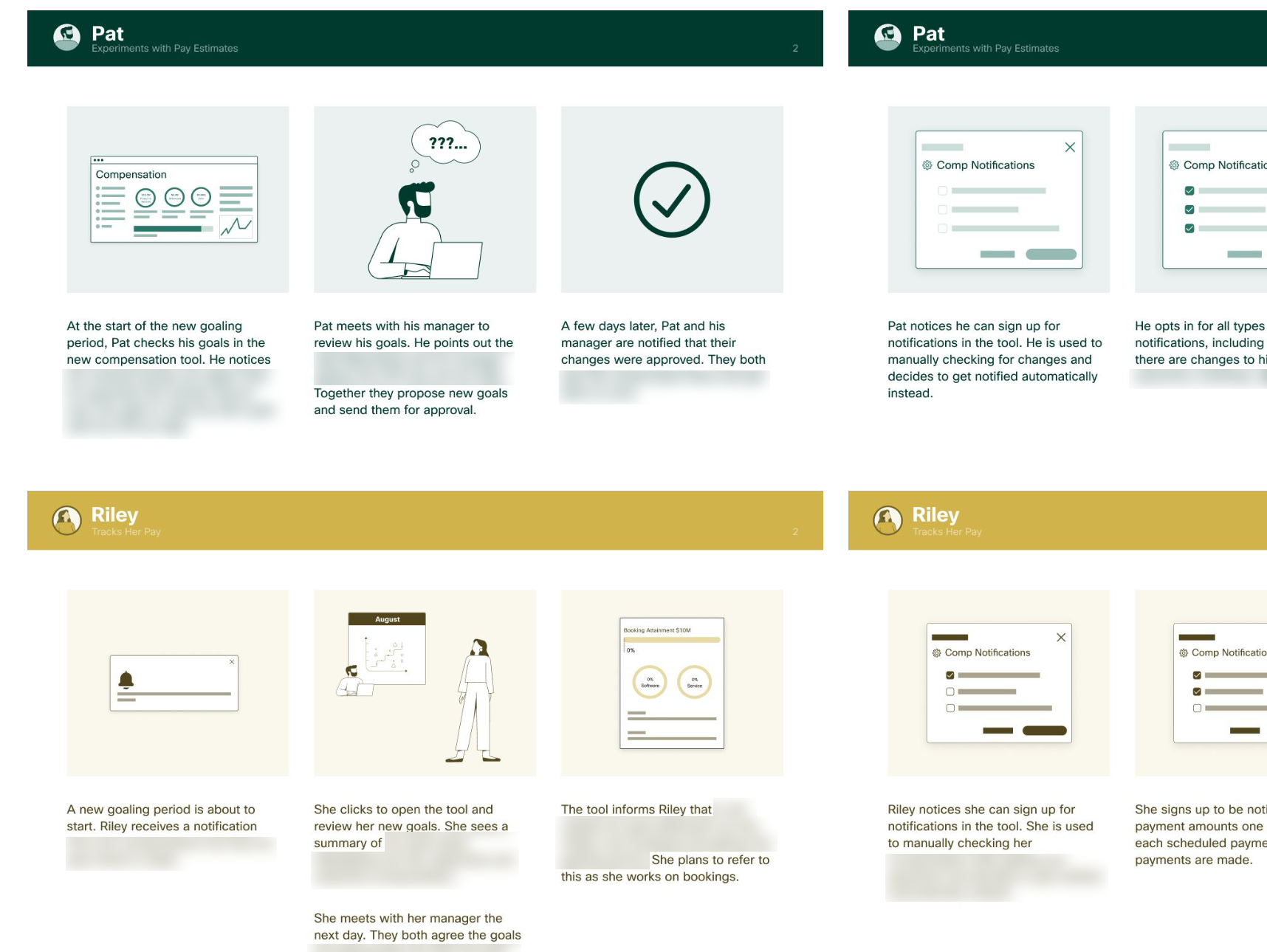
We built future-facing scenarios and storyboards before pixels. With the comp policy itself still in flux, stakeholders needed to react to the story of the experience; not debate the finer points of interface design. Storyboards let Sales Ops and strategy partners engage with the substance early, when changes were cheap.
Research showed sellers think in terms of orders. We organized the entire experience around orders and goals so a seller could see how a single deal might move their numbers.
We created a set of design principles and aligned our stakeholders to them: "Keep it simple," "highlight the most important information," and "avoid making users do the math."
We leaned on existing design-system components for consistent patterns, quick mockup generation and faster engineering. It also streamlined moving to a clickable prototype when the time was right.
We adopted a fintech approach to tame information overload: consolidate functionality that had been scattered across other applications, centralize the key information, make every compensation calculation transparent, and organize everything around the seller's orders. The result moved the experience from "interpret a large dataset" to "engage with an intuitive, digestible interface."
"Thank you for all the work and the thought that went into it… I deeply admire the work that you guys put into this and the output you have delivered so far. And we'll do our best to bring this to fruition."
— Strategy and Planning Director
The vision established the framework for a new compensation experience and resolved intractable issues in the current one. By matching the order-and-goals mental model, the design makes compensation intuitive, which is what drives genuine behavioral adoption. It also, through a credit-card app-style interface, clearly explains how and when adjustments occur.
Keeping sellers' workflow and pain points front-and-center gave business partners a new way to approach the problem and to imagine future states from the user's point of view. We also provided the stakeholder group with a validated user flow that we could build out iteratively and continue to test.
Working closely with the development team throughout meant fewer surprises later. Utilizing established design system components, in addition to looping this group in very early on, minimized churn from scope creep and lack of clarity around requirements.
Starting from the big picture — and letting user feedback choose the path — is how an ambiguous, high-stakes problem becomes a solution the whole org can get behind.