Creative Direction · Art Direction · Leadership
To help coach a colleague, I wrote up a spec brief around how REI corporate wanted to be more involved in local communities and partner with local makers and artists in a way that was relevant to fashionable, environmentally conscious urbanites in cities like Portland, Austin, San Francisco and Seattle. I then worked with a graphic designer and illustrator to build a visual system for this sub-brand.
Art Direction / Lead Designer — Laura Worrick
My friend and colleague Laura Worrick wanted to find a spec brief to work on for her portfolio. Based on my years of experience working in agency, I created a brand problem both grounded in real-world context and inspiring for Laura. I wanted to create a situation where she would be challenged to create a brand system that was grounded in something that already existed, but also would give her room to explore.
After some discussion we came up with:
"REI corporate wants to be more involved in local communities and partner with local makers and artists."
The solution had to feel fashionable, and it would be aimed at environmentally conscious urbanites.
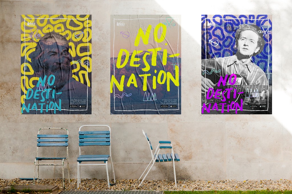
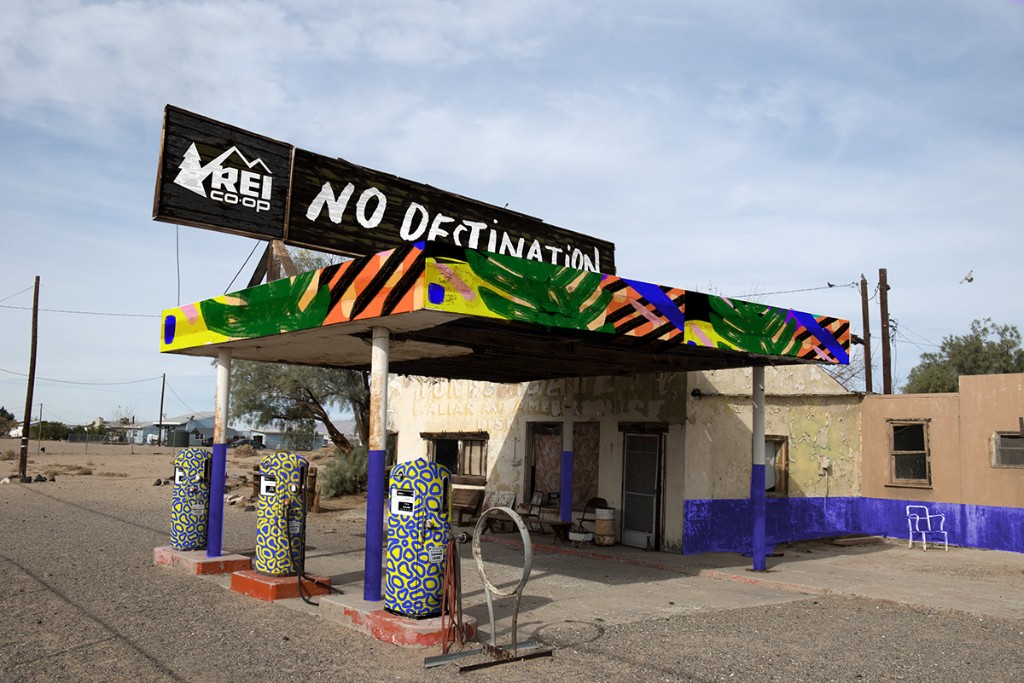
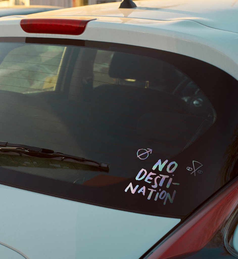
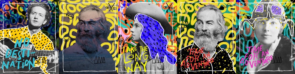
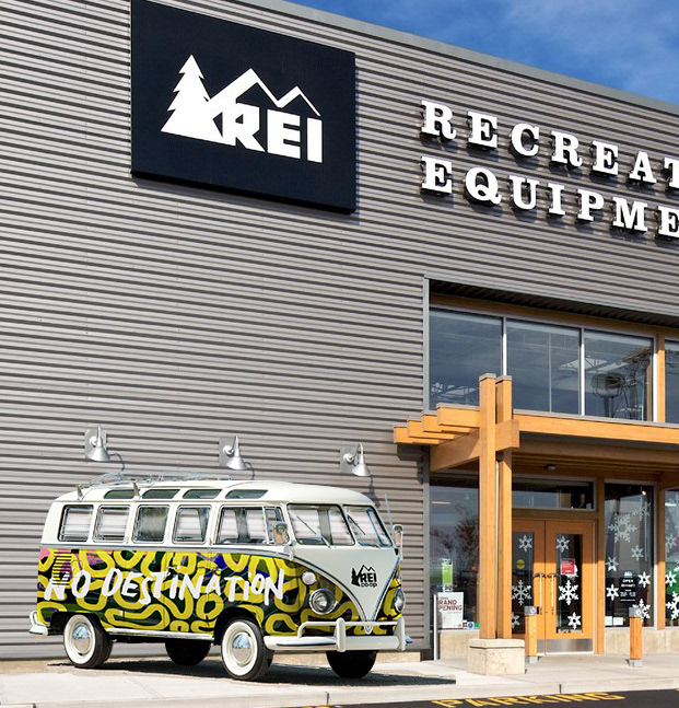
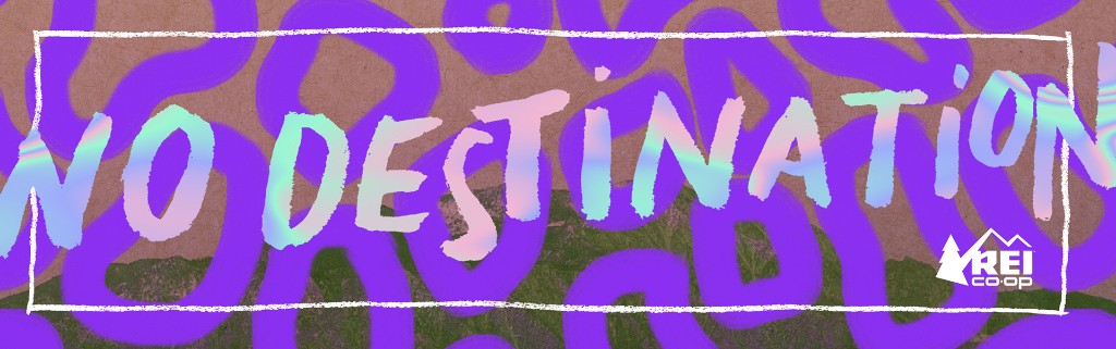
What is adventure without the unexpected? Every mark, every imperfection tells a story. It's not the plans you set out with — it's the journey that unfolds in front of you. No Destination champions the curious, the dreamers, the wanderers, and the path less taken.
We wanted to emphasize the unique and eccentric stories scattered across the American landscape. Researching early American explorers, immigrant cultures, and vintage roadside attractions led us to the name No Destination.
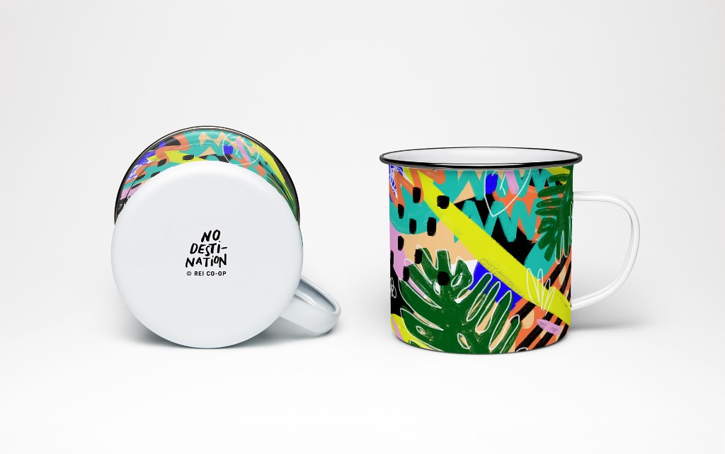
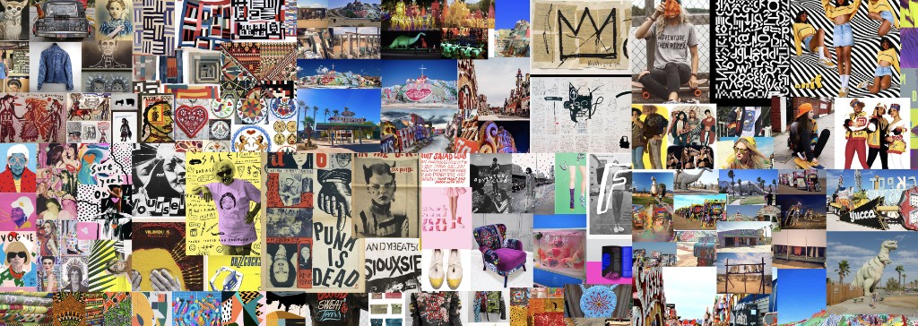
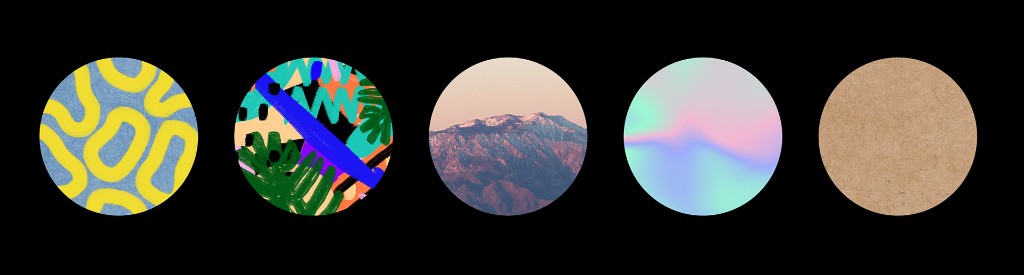
Our moodboards pulled from early-1900s hobo language, outsider art, punk-rock posters, '90s fashion, explorers of the American West, and vintage roadside attractions. Working from those inputs, Laura built a set of incredible stylescapes — which became the foundation for the over-arching design system.

By working this way, artifacts are modular, and can be deployed as individual elements to mix and match; not unlike a design system.
Using these practices that I have employed in various contexts across my career (mind mapping, stylescapes, co-design, open and honest design review), we were able to create an entire identity system.
Oh, and also, Laura ended up getting an amazing job. This is mostly due to Laura being amazing, but I like to believe I had some small part to play there as well.